Every lean manufacturing program eventually runs into the same wall. The ideas are flowing, the kaizen events are producing results, and the improvement culture is taking hold. But somewhere between the conference room and the shop floor, the story of that progress gets lost. It fades into a cluttered poster board that hasn’t been updated in three weeks, or a whiteboard that was wiped clean before last shift’s numbers could be recorded.
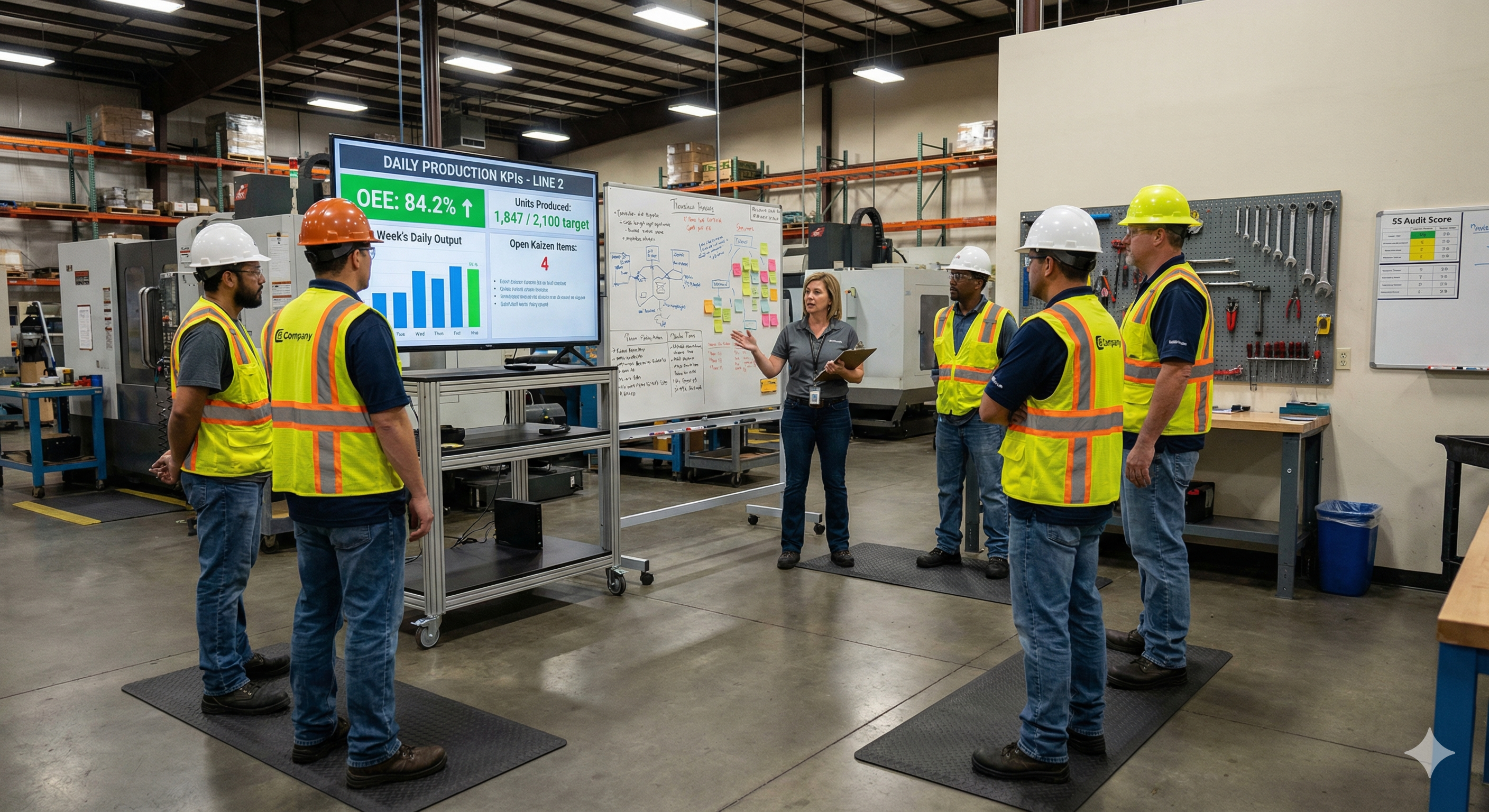
Continuous improvement depends on visibility. When teams can see how their ideas translate into measurable gains, participation grows. When they can’t, CI becomes something that happens in meetings but never quite feels real on the floor. Digital signage solves that disconnect by putting live improvement data, KPI trends, and kaizen tracking on screens where teams actually gather, updated automatically, every shift, without anyone needing to uncap a marker.
Why visibility is the foundation of continuous improvement
The philosophy behind kaizen is deceptively simple: small, steady changes, made by the people closest to the work, compound over time into significant gains. What makes that philosophy succeed or stall is whether those changes are visible. When an operator submits an improvement idea and never hears about it again, the message is clear. When that same idea shows up on a board the next morning, tracked alongside other suggestions with a status and an owner, the message is very different.
Visual management has been a cornerstone of lean manufacturing since the Toyota Production System formalized it decades ago. Andon boards, kanban cards, SQCDP boards, and daily management systems all exist for the same reason: to make the current state of work obvious at a glance. The problem in most plants today isn’t a lack of visual management intent. It’s that the tools being used to deliver it haven’t kept up with the pace of the data behind them.
A printed SQCDP board that tracks safety, quality, cost, delivery, and people metrics is useful on the day it gets posted. By the middle of the week, half the numbers are stale. By the following Monday, the board is either wrong or ignored. That erosion of trust in the data on the wall is one of the quietest killers of CI culture. People stop looking because looking stopped being useful.
The real cost of maintaining manual boards
Most CI coordinators and lean managers know the feeling. Sunday evening or early Monday morning, standing in front of a whiteboard with a stack of printouts, transcribing last week’s numbers by hand. Or walking the floor before a kaizen event, pulling down outdated posters and replacing them with freshly printed ones that will be outdated themselves within days.
The time adds up fast. Plants that rely on manual visual management boards typically spend somewhere between 60 and 100 hours per year just on the act of updating them. That includes printing, formatting, walking the floor, erasing and rewriting, laminating, and dealing with the inevitable situations where someone accidentally erases the wrong column or a poster falls behind a cabinet. For a lean team that is supposed to be spending its time coaching operators and removing waste from processes, that is a remarkable amount of time spent on administrative upkeep.
Beyond the hours, there is the data quality problem. Handwritten numbers introduce transcription errors. Boards that are updated weekly reflect weekly averages, not the shift-level variation that matters most. And because the update cadence is slow, the boards can never reflect the current state of the operation. They reflect the past, and often a version of the past that has already been smoothed over.
The worst part is that stale boards don’t just fail to communicate. They actively communicate the wrong thing. A team walking past an improvement board that shows last month’s numbers learns, over time, to ignore it. Once a visual management tool becomes invisible, rebuilding attention around it is far harder than starting fresh.
How digital KPI boards change the daily standup
The daily standup or shift huddle is the heartbeat of a lean daily management system. It’s where supervisors review yesterday’s performance, identify problems that need attention, assign follow-up actions, and align the team around today’s priorities. In the best plants, these meetings are short, focused, and driven by data.
In practice, too many of these meetings are driven by memory, anecdote, or a printed report that someone grabbed from the office printer five minutes before the huddle started. The data exists somewhere in the MES or BI system, but it hasn’t made it to the place where the conversation is happening. So the supervisor improvises, the team nods along, and the meeting ends without the kind of focused, evidence-based discussion that actually moves metrics.
Digital KPI boards transform the standup by putting the right data in the right place at the right time. A screen mounted in the team’s huddle area can display the previous shift’s key metrics, current status of open corrective actions, trending charts that show whether a metric is improving or deteriorating, and the status of active kaizen events or improvement projects. Because the data updates automatically from your existing systems, there’s nothing to prepare. The supervisor walks up to the screen and the conversation starts from a shared, accurate picture of reality.
This changes the nature of the meeting. Instead of reporting what happened, the team discusses why it happened and what to do about it. The standup becomes a problem-solving session rather than a status update, which is exactly what daily management is supposed to be.
Tracking kaizen events from kickoff to results
Kaizen events are intensive, focused improvement workshops where a cross-functional team tackles a specific problem over the course of several days. They are one of the most powerful tools in the lean toolkit, but they also have a visibility problem. The event itself is energizing. The team works together, maps the process, identifies waste, and implements changes. But once the event ends and participants go back to their regular jobs, the momentum fades quickly if the results aren’t kept in front of people.
Digital signage gives kaizen events a persistent presence on the floor. During the event itself, a screen near the work area can display the team’s objectives, the current state map, and progress against the improvement target. After the event, the same screen can shift to showing the sustained results: whether the cycle time reduction held, whether the defect rate stayed down, whether the new standard work is being followed.
This sustained visibility does two things. First, it holds the team accountable for maintaining the gains. When everyone on the floor can see that the setup time reduction from last month’s SMED kaizen has started creeping back up, the conversation about why happens naturally. Second, it builds credibility for the CI program itself. Operators who were skeptical about whether kaizen events actually change anything can see the proof on the wall, updated in real time, week after week.
Plants that run multiple kaizen events per quarter can use screen playlists to rotate between active and recently completed events, giving each one a window of visibility proportional to its relevance. That rotation keeps the content fresh without requiring anyone to manually swap out posters or decide what goes where.
Building a culture where everyone sees the score
One of the most common frustrations in continuous improvement is the gap between the leadership team that understands the plant’s performance and the frontline teams that actually drive it. Leaders have dashboards, reports, and weekly reviews. Operators have whatever is taped to the wall near their workstation, if anything.
Digital signage closes that gap in a way that static boards never could. When every team area has a screen showing the metrics that matter to that team, updated in real time, a shared understanding of performance emerges organically. Operators don’t need to wait for a monthly town hall to find out how the plant is performing. They see it every day, in the context of their own work.
This transparency has a compounding effect on engagement. Research into kaizen culture consistently shows that the most important predictor of whether continuous improvement takes root is whether leaders are visibly and consistently engaged with it. Digital boards provide that visible engagement. When leadership reviews the same screens the teams are looking at, and references those metrics in conversations on the floor, it signals that the data matters and that improvement efforts are being noticed.
Over time, this visibility shifts the culture from one where improvement is a top-down initiative to one where it is a shared habit. Teams start pointing to the screen during shift handoffs. Operators flag anomalies they noticed on the trend chart. Suggestions increase because people can see the impact of previous suggestions reflected in the numbers. The screen becomes a catalyst for the kind of conversations that lean programs are designed to generate.
Connecting to the data you already have
Most manufacturing plants are not short on data. They are short on ways to get that data in front of the people who need it. The MES is logging every cycle. The quality system is recording every defect. The EHS platform is tracking every near-miss. The problem is that all of this information lives in systems that require a login, a laptop, and time that floor teams don’t have.
Screenly works with the tools your plant already uses. If your CI metrics live in a BI platform like Power BI or Tableau, you can display those dashboards directly on screen. If your engineering team has built custom dashboards in Grafana to monitor process data, Screenly’s Grafana integration lets you push those dashboards to any screen in the plant with token-based authentication and configurable refresh intervals. If your data lives in spreadsheets, databases, or custom web applications, those can go on screen just as easily. Anything that renders in a browser can render on a Screenly display.
This matters because it means you don’t need to rebuild your data infrastructure to get visual management right. You connect Screenly to what you already have, and the screens become windows into the systems your teams already trust.
Build exactly what your floor needs with Edge Apps
Off-the-shelf dashboards are a strong starting point, but every plant has its own rhythms, its own metrics, and its own way of running daily management. That’s where Screenly Edge Apps come in.
Edge Apps is a developer framework that lets your team build custom digital signage applications using standard web technologies like HTML, CSS, and JavaScript. These apps run directly on the Screenly Player, which means they render instantly, update in real time, and keep working even if the network connection drops temporarily. For production environments where uptime matters, that local execution model is a significant advantage.
What makes Edge Apps especially useful for CI teams is the ability to connect directly to your plant’s data sources. Your team can pull from MES systems, SQL databases, IoT platforms, historians, or REST APIs and render the data in whatever format makes sense for the floor. That might be a custom kaizen tracking board that shows every active improvement initiative with its owner, status, and expected completion date. It might be a CI scorecard that calculates and displays a composite improvement index based on several underlying metrics. It might be a suggestion tracker that shows how many ideas have been submitted this month, how many have been implemented, and what the estimated savings are.
Edge Apps can also respond dynamically to your data. You could build an app that displays a standard KPI dashboard under normal conditions but switches automatically to highlight a specific metric when it crosses a threshold. If your first-pass yield drops below target, the screen can shift to show the relevant trend chart and the corrective action log, drawing immediate attention to the issue without anyone needing to intervene.
Screenly’s open-source Playground on GitHub provides ready-made Edge App examples that your team can use as starting points, fork, and customize for your specific CI workflows. If your plant has developers or controls engineers comfortable with web technologies, they can build tailored visual management tools that no off-the-shelf product could match.
Deploying screens where continuous improvement happens
Placement matters more than most teams expect. A screen in the wrong location is just furniture. A screen in the right location becomes part of the workflow.
For CI and daily management, the highest-value locations are the places where teams already gather. That means the huddle area where daily standups happen, the entrance to a cell or line where operators start their shift, the break room where informal conversations happen, and the area outside the CI team’s office where visitors and leadership walk by. Each of these locations serves a different purpose. The huddle screen drives structured discussion. The line entrance screen sets context for the shift. The break room screen builds awareness. The hallway screen builds credibility.
Screenly’s remote management makes multi-screen deployments practical even for plants with limited IT resources. Each screen gets a Screenly Player, and from there, everything is managed through Screenly’s cloud dashboard. Content scheduling, screen grouping, playlist rotation, and software updates all happen remotely. If you have five plants running CI programs, you can push a standardized KPI layout to all of them from a single interface, or tailor each location’s screens to its own metrics and priorities.
The hardware setup is straightforward. Mount a commercial-grade display, connect a Screenly Player, point it at your dashboard URL or Edge App, and the screen is live. No complex AV infrastructure, no dedicated IT project, and no recurring walks around the plant to update content by hand.
Measuring whether your visual management is working
It’s worth pausing on an important question: how do you know if your digital KPI boards are actually driving improvement, or just decorating the wall in a more expensive way?
The answer comes from watching the behaviors around the screen, not just the content on it. Effective visual management boards generate conversation. Teams reference them during standups. Supervisors point to trend lines when coaching. Operators notice when a metric changes and ask why. If the screens are up but nobody is talking about what’s on them, the content probably needs to change, not the technology.
Start by tracking a few leading indicators. Are daily standups starting faster because the data is already visible? Are more improvement suggestions being submitted now that past results are on display? Are kaizen event gains being sustained longer because the post-event metrics are visible to the team? Are supervisors spending less time preparing for huddle meetings?
These behavioral shifts are the real return on investment. The time savings from eliminating manual board updates are meaningful, but the cultural impact of making improvement visible, persistent, and unavoidable is what transforms a CI program from a corporate initiative into a shop-floor habit.
Getting started
If your plant is already collecting CI and KPI data digitally, you are closer to a live floor display than you might think. The gap between where your data lives today and where it needs to be visible is smaller than most teams assume, and Screenly is built to close it quickly.
Download the free 2026-27 Digital Signage Readiness Checklist to find out what you need to go live and how fast you can get there.