Every manufacturing plant has a safety board somewhere. Usually near the main entrance or outside the breakroom, there’s a sign tracking the number of days since the last recordable incident. It might be a whiteboard with a dry-erase marker. It might be a magnetic dial that someone flips each morning. Whatever form it takes, the intent is the same: keep safety top of mind by putting the numbers where everyone can see them.
The problem is that most of these boards stop working long before anyone takes them down. The numbers go stale because the person responsible for updating them is out sick or reassigned. The marker fades. The board itself blends into the wall it’s mounted on, becoming just another piece of the scenery that people walk past without a second glance. Safety professionals have a name for this: habituation. When a visual stimulus stays the same long enough, the human brain stops registering it entirely.
Digital signage is helping manufacturing plants break that cycle. By moving safety scoreboards, incident countdowns, and near-miss tracking onto screens that update automatically and rotate fresh content throughout the day, facilities are keeping safety communication visible, current, and genuinely useful. More manufacturing facilities are making the switch, and auditors are noticing.
The invisible safety board problem
Static safety boards suffer from a set of predictable failures that compound over time. Understanding them is the first step toward fixing them.
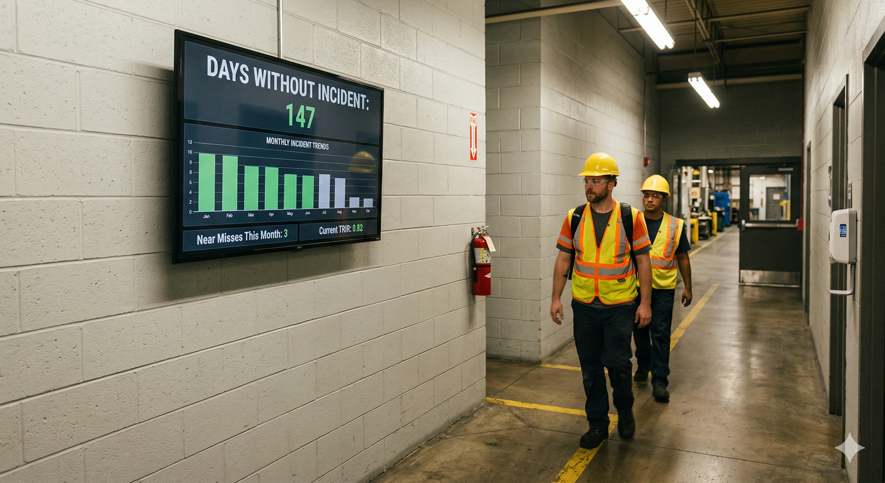
The most obvious failure is accuracy. A days-without-incident counter only works if someone resets it the moment a recordable event occurs and increments it every day in between. In practice, this responsibility often falls to a single person, usually a shift supervisor or safety coordinator. When that person is unavailable, the board stalls. A counter stuck on “47 days” for a week and a half tells employees exactly one thing: nobody is paying attention.
Then there’s the problem of scope. A simple incident counter is a lagging indicator. It tells you what has already happened, but it says nothing about what is about to happen. It doesn’t capture near-miss reports, open corrective actions, upcoming training deadlines, or the facility’s Total Recordable Incident Rate (TRIR) trending over time. Safety professionals know that a plant’s near-miss reporting rate is one of the strongest leading indicators of future incidents. But that information rarely makes it onto a static board because there’s simply no room for it, and no way to keep it current.
Finally, there’s the engagement problem. A board that displays the same format, the same typeface, and the same layout every single day for years will eventually become invisible to the people who walk past it. This isn’t a failure of willpower on the part of employees. It’s how human perception works. The brain is wired to notice change and ignore consistency. A safety board that never changes is designed to be ignored, whether anyone intended that or not.
What a modern safety display should communicate
Moving from a static board to a digital screen is an opportunity to rethink what safety communication actually looks like on the floor. The goal isn’t just to replicate the old whiteboard on a bigger, brighter surface. It’s to turn a passive sign into an active communication channel.
A well-designed digital safety display typically shows a days-since-last-incident counter that resets and increments automatically, pulling from whatever system of record the facility uses. But it doesn’t stop there. The same screen can rotate through the facility’s current TRIR, displayed against the industry benchmark so employees understand where they stand relative to the broader manufacturing sector. It can show the number of near-miss reports submitted this month, reinforcing that reporting hazards is expected and valued rather than something that gets you in trouble.
Trend data is particularly powerful. When employees can see a chart showing that near-miss reports went up while recordable incidents went down, it tells a story about the safety culture that a single number never could. It shows that people are speaking up, that hazards are being caught before they cause harm, and that the system is working.
Digital displays also handle time-sensitive content naturally. Upcoming training deadlines, permit expirations, new PPE requirements for a specific area, and seasonal hazard reminders can all be scheduled to appear when they’re relevant and disappear when they’re not. This kind of dynamic scheduling is impossible with a static board without someone physically walking over to swap out paper inserts.
How digital signage changes the safety conversation
The shift from static to digital does more than solve a logistics problem. It changes the way safety information flows through a facility.
With a static board, communication is one-directional and infrequent. Someone updates the board. Everyone else glances at it (or doesn’t). With a digital display that rotates content throughout the shift, the safety message stays in motion. One rotation might show the incident counter, then cycle to a near-miss trend chart, then display a safety tip related to the most common injury type for that department, then highlight an employee who submitted a valuable hazard report. Each piece of content is a small nudge. Over the course of a shift, those nudges add up.
Supervisors report that digital safety displays change the nature of pre-shift huddles and toolbox talks. When the data is already on the screen and everyone has seen it walking in, the conversation starts at a higher level. Instead of spending time reading numbers aloud from a clipboard, the team can jump straight into discussing why near-miss reports spiked in a particular area or what the team is going to do about a recurring hazard.
There’s also a morale dimension that’s easy to underestimate. When a plant hits a milestone, say 500 days without a lost-time incident, a digital display can celebrate it in a way that actually feels like a celebration. A full-screen graphic, a congratulatory message from the plant manager, a visual timeline showing the journey. Compare that to someone writing “500” on a whiteboard with a marker. The digital version communicates that leadership is paying attention and that the achievement matters.
Meeting compliance and audit expectations
Safety communication isn’t just good practice. It’s a regulatory expectation. OSHA’s standards under 29 CFR 1910.145 establish requirements for accident prevention signs, including specifications around visibility, readability, and employee comprehension. The General Duty Clause further requires employers to communicate hazards effectively to all workers, including those who may not read English.
Digital signage addresses several of these requirements more effectively than static boards. Content can be displayed in multiple languages and rotated based on shift demographics. Font sizes can be calibrated for readability at the distances OSHA specifies. And because digital content is managed centrally, there’s a built-in consistency that’s hard to maintain across dozens of hand-updated boards spread across a large facility.
For plants pursuing or maintaining OSHA Voluntary Protection Program (VPP) status, the bar is even higher. VPP sites are expected to demonstrate management commitment and employee involvement in safety programs that go beyond minimum compliance. A facility with outdated, handwritten safety boards sends a very different signal to a VPP auditor than one with live, data-driven safety displays updating in real time across the floor.
Digital signage platforms that offer proof-of-play logging add another layer of audit readiness. These logs record exactly when specific safety messages were displayed and for how long. In the event of an OSHA inspection or an incident investigation, that documentation can demonstrate that safety information was actively communicated to employees on the days and shifts in question. Try producing that kind of evidence from a dry-erase board.
Designing displays that people actually watch
The effectiveness of a digital safety display depends heavily on how it’s designed and where it’s placed. A screen that’s too small, positioned poorly, or cluttered with too much information will fail just as thoroughly as the static board it replaced.
Placement matters more than most people realize. The best locations are where employees naturally pause or gather: near time clocks, at the entrance to production areas, in breakrooms, and adjacent to safety showers or PPE stations. The screen should be at eye level and sized appropriately for the viewing distance. A 55-inch display works well for a hallway or breakroom. A line-side display viewed from further away might need 65 inches or larger.
Content design should prioritize glanceability. Operators and technicians don’t stand in front of safety displays studying them. They catch the content in passing, which means every screen in the rotation needs to communicate its message in three to five seconds. Large numbers, clear color coding (green for on track, yellow for caution, red for alert), and minimal text are the foundations of a display that actually gets read.
Rotation pacing is another design lever. Cycling through content too quickly creates a sense of visual noise that people tune out. Too slowly, and the display feels static again, triggering the same habituation problem. Most facilities find that 10- to 15-second intervals per screen work well for safety content, with the full rotation completing every two to three minutes so that someone standing in one spot sees the complete message set.
Variety within the rotation is what keeps the display from fading into the background. Mixing data-driven screens (incident counters, trend charts, TRIR comparisons) with narrative content (safety tips, employee recognitions, training reminders) creates enough visual diversity to hold attention over weeks and months rather than just the first few days after installation.
Rolling out safety displays across shifts and sites
One of the most significant advantages of a cloud-managed digital signage platform is the ability to deploy and update safety content across multiple shifts, departments, and facilities from a single interface.
Consider a plant running three shifts. Each shift may have different safety priorities based on the work being performed, the experience level of the crew, or recent incidents specific to that time window. With Screenly, safety managers can schedule shift-specific content so that the night shift sees reminders about fatigue-related hazards while the day shift sees content about forklift traffic in high-congestion areas. The scheduling happens in the cloud dashboard, not by someone walking to the screen and changing a USB drive.
For multi-site operations, centralized management means that a corporate safety update, a new PPE policy, or a company-wide safety stand-down announcement can be pushed to every screen in every facility simultaneously. At the same time, individual plants retain the ability to display their own site-specific metrics and messages. This balance of global consistency and local relevance is nearly impossible to achieve with static boards, where every site is effectively managing its own island of safety communication.
Screenly’s hardware is designed for the kind of environments where safety displays live. The Screenly Player connects to any commercial display, renders web-based content natively, and is managed entirely through the cloud. There’s no need for a dedicated PC at each screen, no local software to maintain, and no manual content transfers. Mount the screen, connect the player, point it at your content, and manage everything remotely from that point forward.
Build custom safety displays with Screenly Edge Apps
Off-the-shelf dashboard tools can handle basic safety scoreboards, but many facilities need displays that pull from their own systems and present data in formats tailored to their specific safety programs. That’s where Screenly Edge Apps come in.
Edge Apps is a developer framework that lets your team build custom digital signage applications using standard web technologies: HTML, CSS, and JavaScript. These apps run directly on the Screenly Player, which means they’re fast, reliable, and continue operating even if the network connection drops temporarily, a quality that matters in production environments where uptime is non-negotiable.
What makes Edge Apps particularly relevant for safety displays is their ability to connect to the systems where your safety data already lives. Your team can build an Edge App that pulls data from SafetyCulture (formerly iAuditor), your EHS management system, or a custom safety database and renders it on screen in whatever format makes the most sense for your floor. SafetyCulture’s public API, for example, exposes inspection data, issue tracking, and action items that can be queried and displayed in real time. If your facility uses a different platform, whether it’s Intelex, VelocityEHS, Enablon, or a homegrown system with a REST API, the same approach applies.
Edge Apps can also incorporate logic that makes the display context-aware. An app could monitor your days-without-incident counter and automatically switch the screen’s color scheme when the count resets, making the change impossible to miss. It could pull open corrective actions from your EHS system and display an alert when any action is overdue. It could compare the current month’s near-miss reporting volume against the trailing average and surface a message encouraging more reports if the rate is falling behind.
Because Edge Apps are built on standard web technologies, any developer comfortable with front-end work can create one. Screenly’s open-source Playground on GitHub provides ready-made examples that teams can use as starting points, adapting them to connect to their own data sources and match their facility’s visual standards. The result is a safety display that looks and behaves exactly the way your safety program needs it to, not a generic template that almost fits.
Why safety visibility is a culture signal
There’s a broader point worth making about what safety displays communicate beyond the data they show. The presence (or absence) of current, well-maintained safety information on the floor is one of the most visible signals of a facility’s safety culture.
When an employee walks into a plant and sees a digital display showing today’s incident-free count, this month’s near-miss trends, and a congratulatory message for a team that completed hazard identification training, it sends a message. It says that safety is actively managed here. It says that leadership invests in keeping people informed. It says that the numbers matter enough to put on a screen that updates itself rather than a board that someone might get around to updating next week.
The reverse is also true. A faded safety board with last quarter’s numbers, a broken dial counter stuck on a number nobody believes, or an empty frame where a poster used to be tells employees everything they need to know about where safety falls on leadership’s priority list. These signals are absorbed quickly, often unconsciously, and they shape behavior far more than any policy document or annual training session.
Digital signage gives manufacturing safety programs the visibility they’ve always deserved. It takes the metrics that safety professionals work hard to track and puts them where they can do the most good: in front of the people whose daily decisions determine whether everyone goes home safe.
Ready to see if your plant is a fit?
If your facility is tracking safety metrics in a spreadsheet, an EHS platform, or even on paper, you already have the data you need to power a live safety display. The gap is getting that data onto the floor in a format that stays current and stays visible. Download the free 2026-27 Digital Signage Readiness Checklist to find out what you need to go live and how quickly you can get there.